Create A Cool Layout Using CSS
Make money for being or staying online/internet.
You will get a $50 starting gift when you join using this code: Exode4LKrbujm1z and link:: GET THE OFFER NOW!!
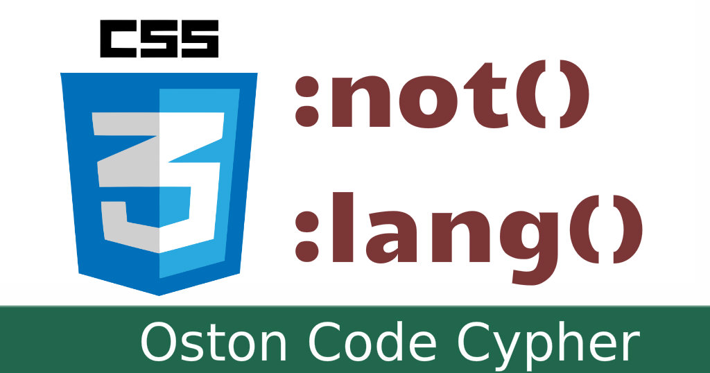
Css is every web designer's favorite styling language to create layouts, graphics, shapes among others. To make it, even more, cooler it's very simple to learn, Yeah you heard me right, It's simple to learn.
To be more specific, in this tutorial I concentrated more on the shapes. With CSS shapes it enables us to flow content around circles, polygons, masks, ellipse, and other shapes.
In this post, I will share you with the youtube tutorial source code and also explain some of the CSS properties that I used to come up with such layout or effect.
Tutorial
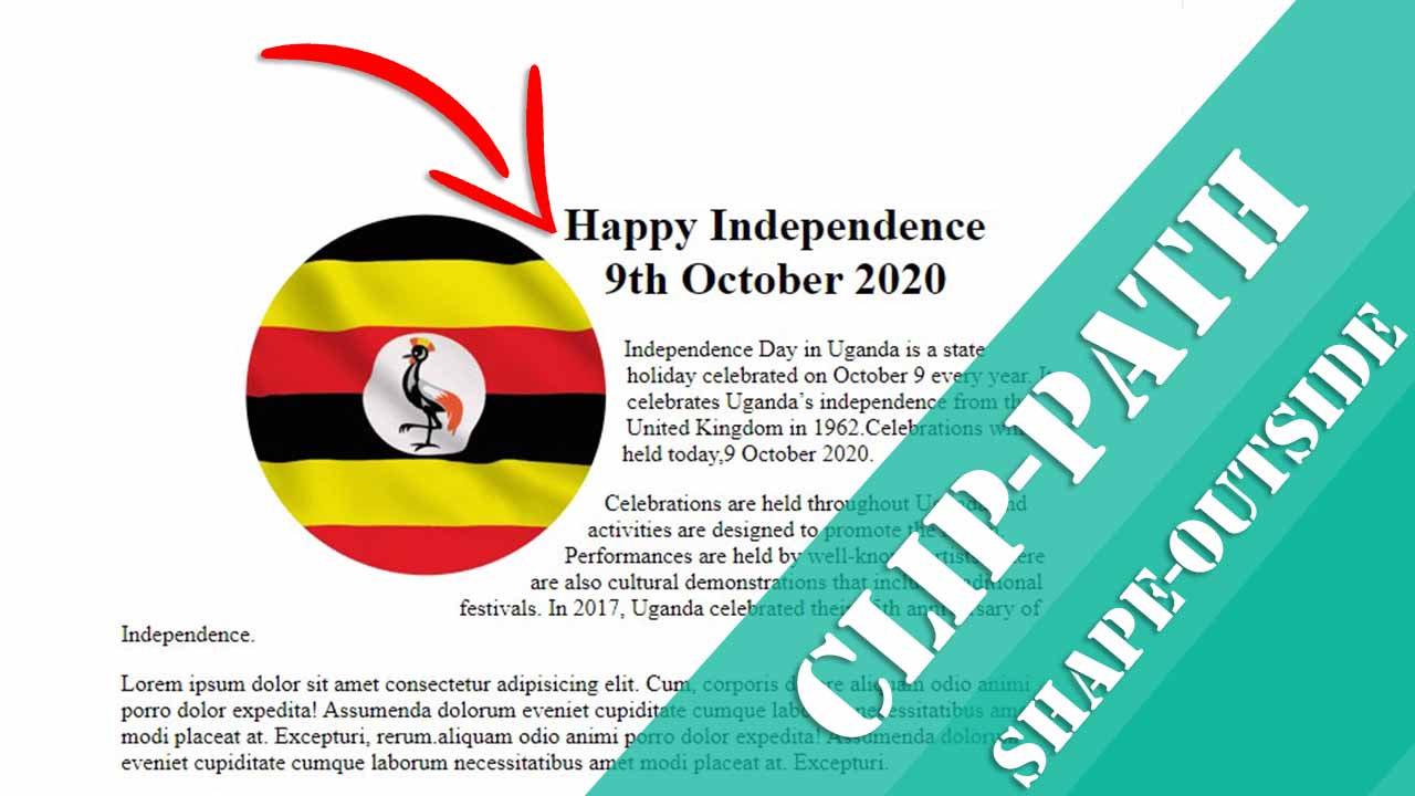
The clip-path Property
The clip-path CSS property creates a clipping region that sets what part of an element should be shown. Parts that are inside the region are shown, while those outside are hidden.
The shape-outside Property
The shape-outside CSS property defines a shape—which may be non-rectangular—around which adjacent inline content should wrap.
HTML
Please note you can use this code in any project that you want, so the markup that i used in the tutorial was just for the layout(it's your choice, your limit). The main focus is on the styling file.
<div class="container">

    <div class="info">
      <img src="uganda.jpg" alt="uganda">
      <div class="content">
        <h1>Happy Independence 9th October 2020</h1>
        <p>Place your content here</p>
      </div>
    </div>

 </div>
CSS code
/*This code is just for centering the content in the middle of the page*/
body{
  display: flex;
  flex-direction: column;
  align-items: center;
  justify-content: center;
  height: 100vh;
}
/*End here*/

/*Giving the container equal width both on the left & right side*/
.container{
  max-width: 80%;
  margin:0 auto;
}
/*Ends here*/

/*This is where the magic happens.*/
.info img{
  float:left;
  margin-right:.1rem;
  margin-bottom:.2rem;

  clip-path: circle(35% at 50% 50%);
  shape-outside: circle();
}

@media screen and (max-width: 684px){
  .info img{
    float:none;
    clip-path: none;
  }
}
Download the project files from my Github repo.
Save up to 80% with this Domain & Shared Hosting package deal! 80% OFF - GET OFFER NOW
Related Post(s)
» CSS explained in a few lines
» Creating A Pure CSS Preloader - Source Code
» Create A Cool Layout Using CSS
» Learn how to create a custom scrollbar with CSS.
» Animated Social Media Icons Using Font Awesome and Materialize CSS
collections_bookmark Category :: Cssdate_range Published :: 3 years ago At: 05:23 PM
event_note Detailed Date :: Oct 09th, 2020
person Writer :: Code
- RECENT POSTS
 1 year ago
How to force the browser to cache a page?
There are several ways to force a web browser to cache an HTML page:
 1 year ago
How can i cache pages using php?
You can use the output buffering functions in PHP to cache pages. Output buffering allows you to store the output of a PHP script in a buffer, which you can then manipulate before sending it to the client.
 1 year ago
PHP is a popular programming language that is widely used for web development. It stands for "PHP: Hypertext Preprocessor" and is a server-side scripting language. This means that it is executed on the server, rather than in the user's web browser.
 1 year ago
HTML, or Hypertext Markup Language, is the standard markup language for creating web pages and web applications. It is used to structure and organize content on the web, and to create the basic structure and layout of a webpage.
 1 year ago
CSS, or Cascading Style Sheets, is a stylesheet language used for describing the look and formatting of a document written in HTML. CSS is used to control the presentation of multiple web pages at once, making it a crucial tool for web developers and designers.
 3 years ago
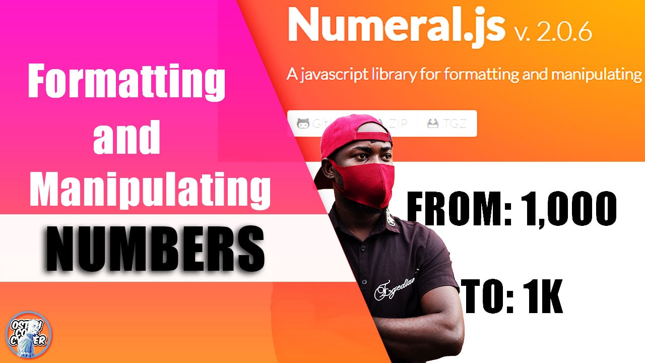
A JavaScript library for formatting and manipulating numbers - Numeral.js
Check out this lightweight JavaScript library used for formatting and manipulating numbers.
 3 years ago
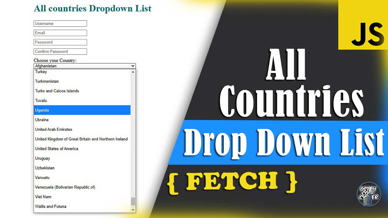
All Countries Drop Down List | HTML Select Country Name
This simple country dropdown list is freely available for you to copy and use in your project forms.
 3 years ago
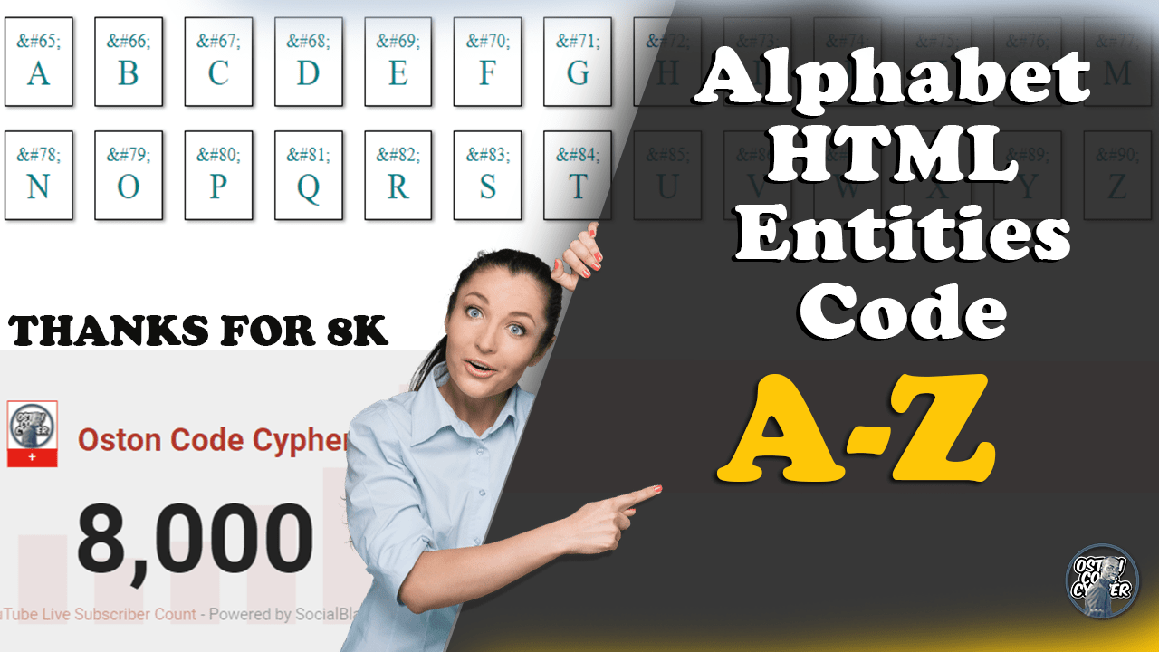
HTML Entities Code Alphabet Discovery Using JavaScript
In this post I will show how writing just a few lines in JavaScript will allow you to render, browse and discover the alphabetical letters using a set of HTML entity codes.
- ADVERTISEMENT