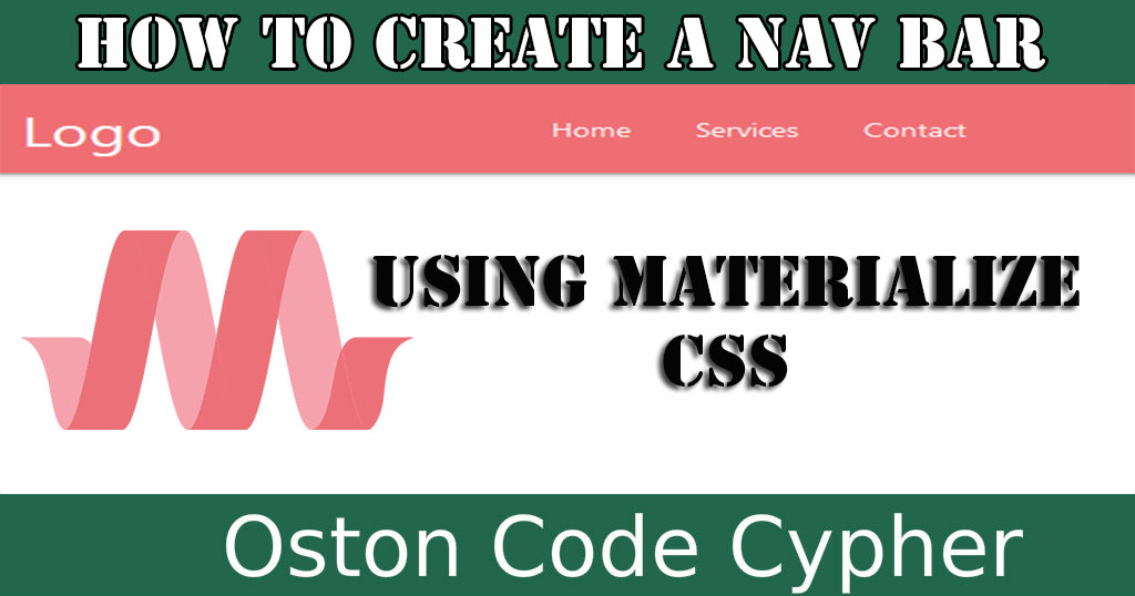
How to create a Nav Bar Using Materialize CSS
Make money for being or staying online/internet.
You will get a $50 starting gift when you join using this code: Exode4LKrbujm1z and link:: GET THE OFFER NOW!!
A navigation bar is a section of a graphical user interface intended to aid visitors in accessing information.
If you are a web developer or site owner this is something that you should care about a lot besides the website content. This will enable your visitors or users to easily navigate your webpages and access the information they need.
In this article I round up with one of the best CSS modern responsive front-end framework based on Material Design. Using this framework I will show you step by step how you can create, add or design your navbar, menu bar whatsoever you call it.
When using this framework's navbar, you should note that there are two main parts of the navbar that is to say; the logo or brand link and navigations links that are wrapped inside the unordered list.
Enough of that, let's get started.
Note:If you are using a backend language like PHP, I would advise you to create sperate file for you navbar, for example, navbar.php, so that it would be easy for you to maintain and include on different pages across the entire website using the require_once() or include() functions.
Step 1
Create a file with a suitable name like index.html or anything you want and put in the boiler structure for HTML.
Step 2
By this time i assume you have the materialize css files(CSS and Javascript). If not download them from here or use these CDN links
If you downloaded the files include them in the head section of your file you created recently.For example,
In case you prefer CDN links, add the following lines in the head section.
<link rel="stylesheet" href="https://cdnjs.cloudflare.com/ajax/libs/materialize/1.0.0/css/materialize.min.css">


<script src="https://cdnjs.cloudflare.com/ajax/libs/materialize/1.0.0/js/materialize.min.js"></script>
Step 3
Finally add this markup in the body section.
Now let's digest the different classes that you are seeing up there.
| Class | Details |
|---|---|
| nav-wrapper | As it says, it wraps the items inside the parent nav element. |
| container | This is used to establish equal width for the navbar both on the right and left. |
| brand-logo | This increases the logo's or brand name's font-size to 2.1rem inorder for it to stand out from the rest of the text. Try removing it and putting it back to see the changes. |
| right | This floats the menu links to the right. But you can also use left class to float them to the left. |
This is just the basic way of creating a nav bar or menu bar using materialize CSS. Such nav bar will be for desktops not mobile devices meaning it's not responsive.
Incase you want to learn how to create a Simple and Responsive Sidenav here is the right article. How to create a Simple and Responsive Sidenav
Save up to 80% with this Domain & Shared Hosting package deal! 80% OFF - GET OFFER NOW
Related Post(s)
» How to create a simple Autocomplete Search Engine Using Materialize CSS
» How to create a Simple and Responsive Sidenav
» How to create a FAQ section using Materialize CSS Framework
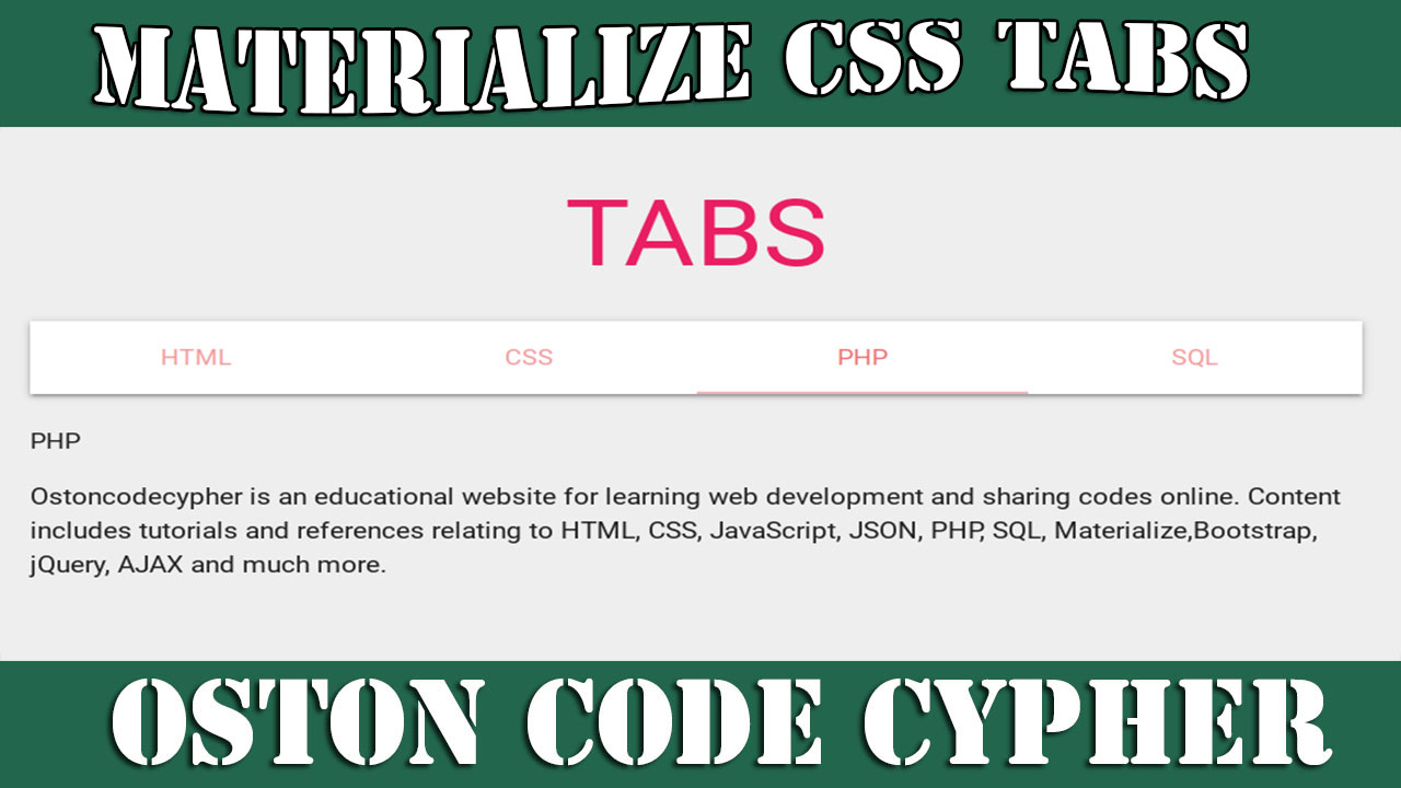
» How to create Simple & Responsive Tabs using Materialize CSS
» How to create Parallax Scrolling Effects using Materialize CSS
collections_bookmark Category :: Materialize cssdate_range Published :: 4 years ago At: 11:09 PM
event_note Detailed Date :: Sep 12th, 2019
person Writer :: Timothy