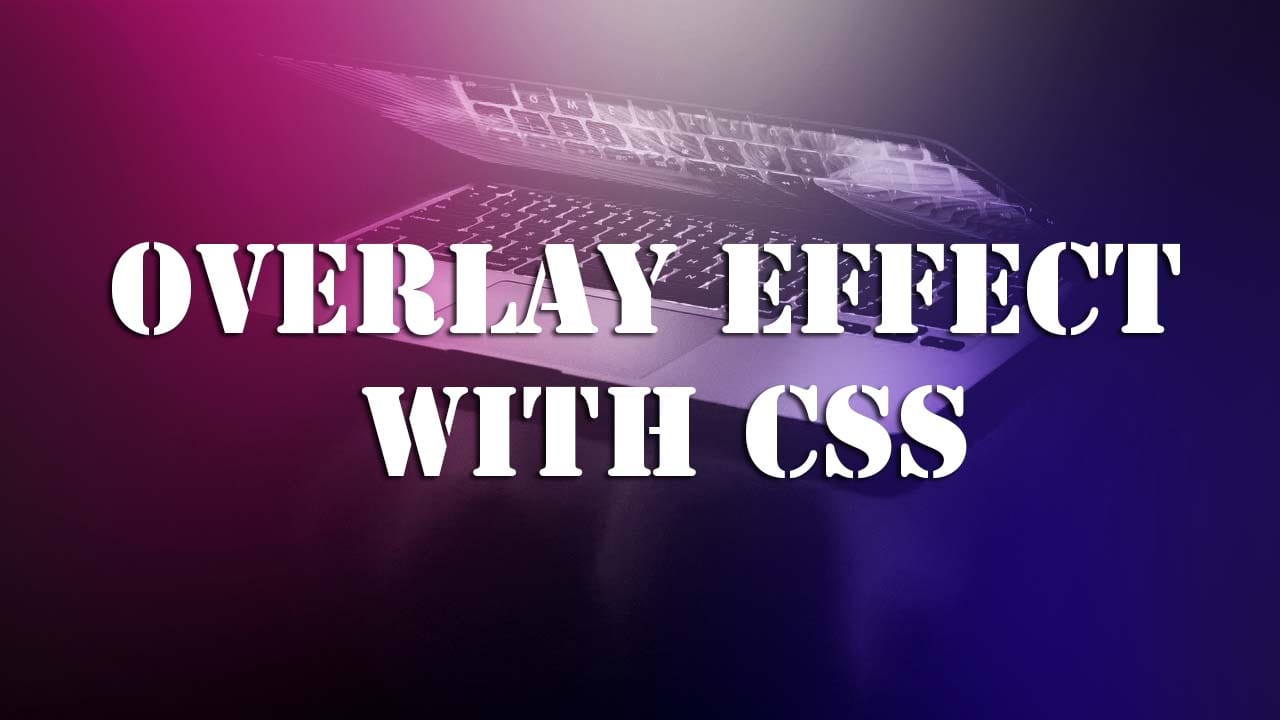
Learn how to create an overlay effect with CSS
Make money for being or staying online/internet.
You will get a $50 starting gift when you join using this code: Exode4LKrbujm1z and link:: GET THE OFFER NOW!!
In this simple article you will learn how to create an overlay effect with CSS.
Overlay means to cover the surface of something with a transparent background. In other words, it is used to set one thing on the top of another.
The overlay makes a web-page attractive, Provides holds extra information for the user to take action and more so it is easy to design.
HTML - Markup
<div class="overlay">
<div class="info">
<div class="close" id="closeOverlay">×</div>
<h2>Oston Code Cypher</h2>
<p>Join me today and get your life time tutorials for FREE.</p>
<button class="btn">Subscribe</button>
</div>
</div>
CSS - Styles
Having only this code targeting the element with the overlay class will create the effect.
.overlay{
	width:100%;
	height:100%;
	background-color:rgba(0,0,0,0.9);
	position:fixed;
	top:0;
	left:0;
	right:0;
	bottom:0;
	z-index:2;
	display:none;
}
The rest of the code I wrote was to style the layout or position of the elements I put in the inner div with the class of info.
Tutorial Code
body{
}


.container{
max-width:80%;
margin:0 auto;
margin-top:20px;
}

.overlay{
width:100%;
height:100%;
background-color:rgba(0,0,0,0.9);
position:fixed;
top:0;
left:0;
right:0;
bottom:0;
z-index:2;
display:none;
}

.info{
display:flex;
flex-direction: column;
align-items: center;
justify-content: center;
height:100vh;
color:#fff;
opacity:0;
animation: channelInfo 1s ease-in 1.5s;
animation-fill-mode:forwards;
}

.info h2{
margin-bottom:0;
}

.info p{
font-size:20px;
}

.close{
position: absolute;
top:0;
right:0;
margin:20px 20px 0 0;
transform:scale(2);
transition:all 0.6s ease-in;
}

.close:hover{
color:#00796b;
cursor: pointer;
transform: scale(3) rotate(360deg);
}

.btn{
background-color:#00796b;
color:#fff;
padding:10px;
border:0;
border-radius:5px;
box-shadow: -2px 3px 4px rgba(0,0,0,0.5);
cursor: pointer;
transition: background-color 0.5s ease-in-out;
}

.btn:hover{
background-color: tomato;
}

@keyframes channelInfo{
0%{
opacity:0;
}

100%{
opacity:1;
}
}
In this next post, I will add javascript to open and close the overlay.
Save up to 80% with this Domain & Shared Hosting package deal! 80% OFF - GET OFFER NOW
Related Post(s)
» Overriding The Default Text Selection Color With CSS
» How to create a Cutout Text Effect using CSS
» How to create Text Animation using HTML and CSS
» Learn how to create a custom scrollbar with CSS.
» Learn how to create an overlay effect with CSS
collections_bookmark Category :: Cssdate_range Published :: 3 years ago At: 12:03 AM
event_note Detailed Date :: Jun 21st, 2020
person Writer :: Code